Tuesday, 13 December 2016

Initial Design Ideas


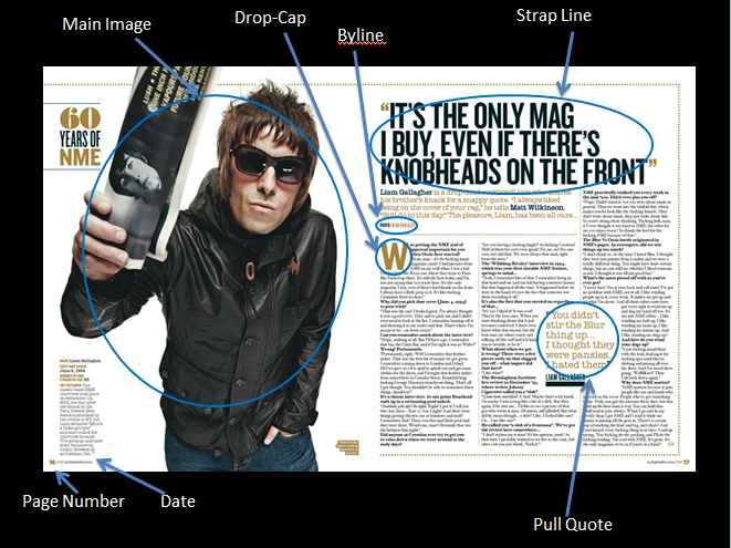
Many ideas were proposed for the main image, some breaking and some conforming to genre conventions. The first idea conformed to genre conventions by being at eye-level and showing the model facing the camera with their arms crossed. This conforms to genre conventions as it connotes rebellion, which is an applicable theme to indie, this can also be associated with Osgerby's 1998 theory stating that " Youth is trouble, youth is fun". A secondary main image idea would have been a high angle close up of the model. This would have played on the downward social comparison gratification of Blumler and Katz' uses and gratifications theory as it would show the model from above, giving connotations of them being lesser than the reader. This is also relative of Keith Gandal's 2007 theory of audiences being drawn to 'rags to riches' stories.


There were multiple titles that were considered for this magazine such as; Just Rock, Amp(ed), and Heavy Roller. The name decided upon name, Amp'd, was derived from Amp(ed) as it was believed to be the most appropriate for the given genre of the magazine, that being indie rock. The name Amp'd has appealing properties that would resonate with a younger audience specifically between 15-24 years as it uses a contraction apostrophe to replicate the way many people of a younger audience speak in terms of removing 'unnecessary' letters from certain words, such as how the 'e' is removed from "Amped" to produce "Amp'd".

Friday, 9 December 2016

Font Ideas/Usages


This is the font I was planning to use for my masthead. I have chosen this font as it suites the style of the type of magazine I am aiming to create, that being indie rock. The font is deliberately blocky and bold as it connotes masculinity, which is prevalent within the rock genre. The way the masthead is spelled is also deliberate in order to further relate it to the rock genre.


This font would work well as a basic type face for my magazine as it is very easily read and follows the general conventions of the indie rock genre. The font is made to appear as if it were from a typewriter which relates the the indie genre as many independent artists have low production costs due to their independence from a large producer. So by using a typewriter-esque font it gives the appearance that the media does not have access to something such as a computer which furthers the connection to the indie genre.


Similar to Bebas Neue, Lemon Milk, would make a suitable font for cover lines due to it's bold and straight-edged look. This makes it stand out more than other fonts and will help contrast it from the background it's on and any surrounding elements of the magazine.

Tuesday, 15 November 2016

Representation & Stereotypes

   This cover of NME supports Mulveys theory that women, in media, are objectified for 'the male gaze'. The mise-en-scene gives evidence to support this as the main image contains a young female artist, Lily Allen, wearing a shirt with a low cut neck. This supports Mulveys theory as her attire could be seen as revealing as it shows skin unnecessarily. This, with the connotations of the use of red being masculinity, implies that the magazine is pandering towards a primarily heterosexual male audience.
   The lexis of the cover also somewhat disrupts Mulveys theory as its states "Lily Allen takes on the world" which implies a sense of masculinity and dominance over a given situation that is not stereotypically linked to the female gender.
   In relation to my own music magazine cover, contents page, and double page spread, I may use and image that disrupts this theory as it could be seen as more daring and interesting.
     This cover of Rock Sound magazine supports Hedbridges theory of youth consisting of two main factors, "youth as fun" and "youth as trouble,". The cover supports this as it clearly shows at least one of sides of this theory. Those on the cover of this magazine fit the mise-en-scene stereotype for youth as they are covered in tattoos, wear snap-back caps, and t-shirts with bold styles and patterns, as well as having very generic hair styles for 'rebellious youth'. As they fit conventions for a rebellious group they fit one side of Hedbridges theory where they represent the "youth as trouble" portion.
     From this I can learn that I may be able to represent this theory in a way that could positively resonate with a younger audience in a way that would encourage viewership.


Friday, 4 November 2016

Audience Research & Profile

Magazine producers use multiple methods to identify their target audience. One of these methods is to isolate what types or groups of people would be interested in their product. This can be done through using common stereotypes to assume or understand what that group would enjoy or want. By pinpointing what is special about their product they can see what correlates to one or more groups in terms of interest. Important features of an audience that a company would have to consider are:
  • Age
  • Gender
  • Class
  • Location
  • Income
  • Interests
  • Religion
There are two main ways of identifying a target audience and that is through the analysis of demographics and psychographics. Demographics are more common and show factual data and information such as age, gender, and location. Psychographics are very different and instead show an audiences personality, attributes, interests, and lifestyle.

As the genre of my product will be rock I have decided to analyse audience profiles of the average reader of a rock magazine. The average profile publishers state their audience fits is:
  • Men
  • 16-30 years old
  • Straight
  • White
  • Extrovert
  • Working Class
From this information I can infer that my audience would be under middle-age, male, open to daring design, and looking for something affordable. I can use this information for when I create my product as it will allow me to shape my magazine to better fit, attract, and entertain a more specific audience rather than blindly hoping to catch someones attention. The psychographics of an audience are slightly harder to pin down and identify than demographics. There are multiple ways of classifying an audiences psychographics, the Young & Rubican method categorises people into 7 sets:
  • The Aspirer
  • The Explorer
  • The Reformer
  • The Mainstream
  • The Struggler
  • The Resigned
  • The Succeeder
Each of these sets has its own defining features based on how they would typically act in life and allows for easy classification of an audience to find out what type of product they would be interested in. For instance, 'The Reformer' is the type of person that values their own opinion over being told what to do, fairly anti-materialistic, and seen as intellectual. From this it can be inferred that someone fitting this group would be only interested in what they find useful or interesting and will not simply follow others and be corralled by the newest and shiniest. Those interested that fit the above profile are the typical audience for the rock genre therefore are most likely going to be the audience for my product. This means that 'The Explorer' could potentially be the set best fitting for my audience as they best respond to brands with instant effects and constantly seek out new thrills.

Tuesday, 1 November 2016

Photography Task: Composition & Framing


Moderately lit, single source behind camera
   to camera right

Casual mise-en-scene

Over-the-shoulder shot, eye-level

Outside, mid-day, high obstruction to camera
   right, low obstruction camera left

Subject has back to camera, head tilted to camera
   left
-------------------------------------------------------
Brightly lit, single source directly behind camera

Casual mise-en-scene

Medium close up, direct address

Outside, mid-day, high obstruction behind
   subject

Subject facing camera, back to wall, head tilted
   slightly forward


-------------------------------------------------------

Dimly lit, single source ahead of camera,
   partially obstructed

Casual mise-en-scene, school rucksack

Medium close up, eye-level

Outside, mid-day, in shade

Subject posture facing away with head turned to
   face camera, hands sprawled comically.
-------------------------------------------------------

This exercise has taught me the importance on depth of field, rule of thirds, and lighting. In future I will most likely use what I have learned to impact my photoshoots through the proper and effective use of these three features. Depth of field and rule of thirds are both useful to help push focus of the reader onto or away from an element of the image. Proper use of lighting will allow me to accentuate certain aspects of the image, which can also help draw focus.