- Masthead:
- Style - Blocky and bold
- Range - One font
- Size - 1/6th the page height
- Colour - Red
- Case - Capitals
- Cover Lines:
- Style - Straight and bold / thin
- Range - Two fonts
- Size - 1/16th the page height / 1/10th the page height
- Colour - White / Red / Black
- Case - Capitals/Sentence Case
- Puffs/Pugs:
- Style - Straight and bold
- Range - One font
- Size - 1/16th the page height
- Colour - White
- Case - Capitals
- Small Print:
- Style - Straight
- Range - One font
- Size - 1/32 the page height
- Colour - Black
- Case - Sentence Case
Contents
- Headings:
- Style - Straight and bold
- Range - One font
- Size - 1/8th the page height
- Colour - Red w/ white outline / White on a black bar
- Case - Capitals
- Subheads:
- Style - Straight and bold
- Range - One font
- Size - 1/16th the page height
- Colour - White on black bar
- Case - Capitals
- Small Print:
- Style - Straight and thin
- Range - One font
- Size - 1/32 the page height
- Colour - Black
- Case - Sentence Case
DPS
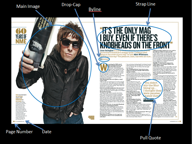
- Headings:
- Style - Bold and straight
- Range - One font
- Size - 1/13th the page height
- Colour - Black
- Case - Capital
- Subheads:
- Style - Small and bold
- Range - One font
- Size - 1/78th the page height
- Colour - Black
- Case - Sentence Case
- Byline:
- Style - Small and italicised
- Range - One font
- Size - 1/78th the page height
- Colour - Black
- Case - Sentence Case
- Pull Quotes:
- Style - Typewriter style
- Range - One font
- Size - 1/39th the page height
- Colour - Gold
- Case - Sentence Case
- Article Copy:
- Style -
- Range -
- Size -
- Colour -
- Case -
- Small Print:
- Style - Typewriter style
- Range - One font
- Size - 1/78th the page height
- Colour - Black
- Case - Sentence Case


